GLIFIC : Crafting a new onboarding process
Glific is a WhatsApp-based open-source 2-way communication platform for NGOs to have conversations with their community. Project Tech4Dev, an initiative of the Chintu Gudiya Foundation, is responsible for its development. Glific aims to empower social organizations to act decisively and quickly on grassroots information through a host of features, ranging from automated responses to comprehensive analytics.

Nature of requirement
The main goal of this development is to optimize internal operations.
Target audience/end-users: NGOs, Finance & Support Team.
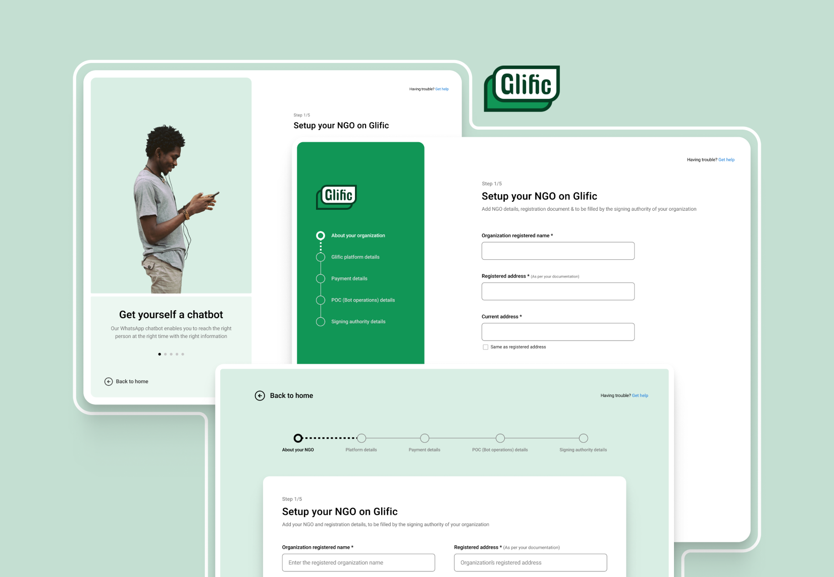
The Glific Onboarding Flow consists of three components:
- Questions to be captured (some are already on the existing form)
- Integration of the Terms and Conditions (T&C) document.
- Collection of data with added validations
Design Iterations
Initial stages (Wireframes)
In order to understand the pertinent data that needed to be entered into the form, we began iterating with simple drawings. We realized that the form would require multiple steps and that it would be better to break it down into more manageable sections to make it easier for users to complete and lessen cognitive overload.
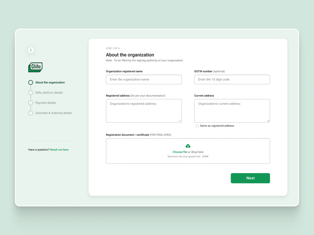
Iteration one (sidebar)
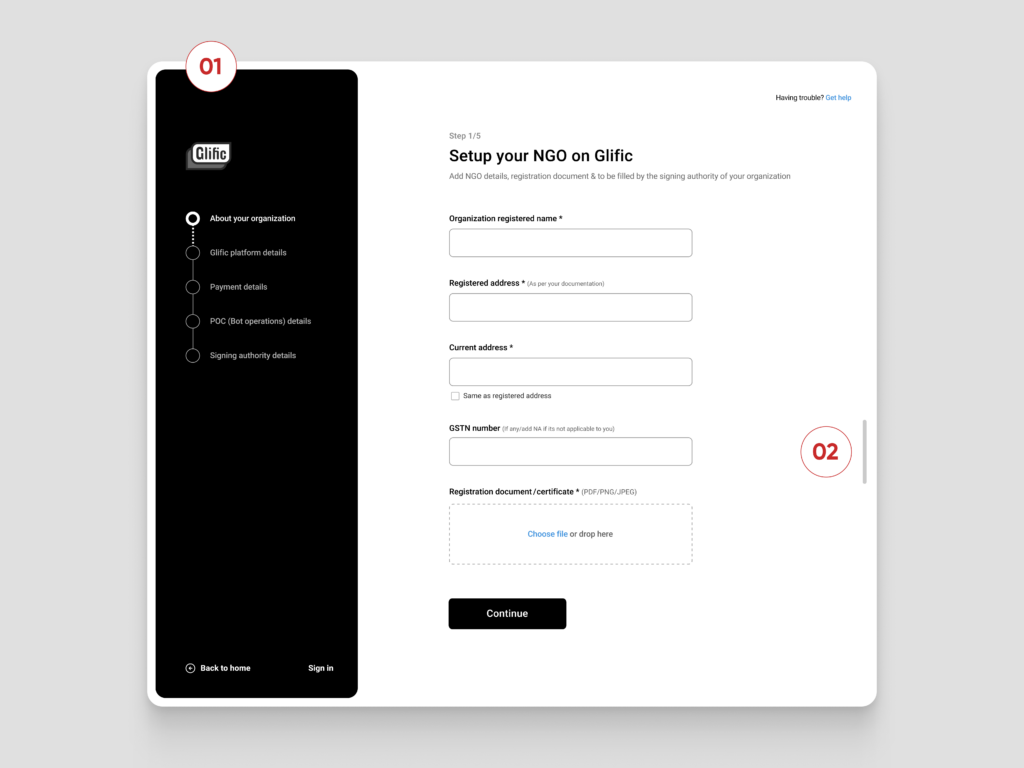
The Upside:
Dividing the lengthy form into several steps. The incorporation of progress bar indicators. To ensure that the user has a virtual map and does not miss the timeline, we included a sidebar with the form timeline along with progress indicators and their statuses in this version.
The Downside:
- We noticed that the sidebar was receiving more attention than the rest of the form, giving the impression that it was the most significant component. In contrast, more focus was needed on the multi-step form and the pertinent information that had to be entered.
- We were aware that, in order to prevent the user from having to scroll further, we needed to optimize the flow and condense the content.
We devised several additional versions that we believed might encompass all the necessary data. However, they also had some shortcomings that we had to overcome in order to obtain the best of the best.
Horizontal Progress Bar
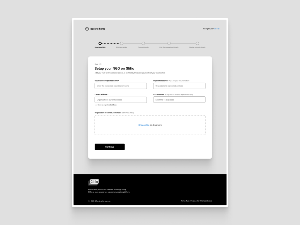
With the branding located in the footer section rather than at the top of the screen, this version had a major drawback. The horizontal timeline, or progress bar, worked effectively, but it took up more room than was necessary for the data that the user had to provide. Users once again had to scroll down to view more.
Takeaways: By arranging two input fields horizontally, users were able to enter more data at once.
Image version
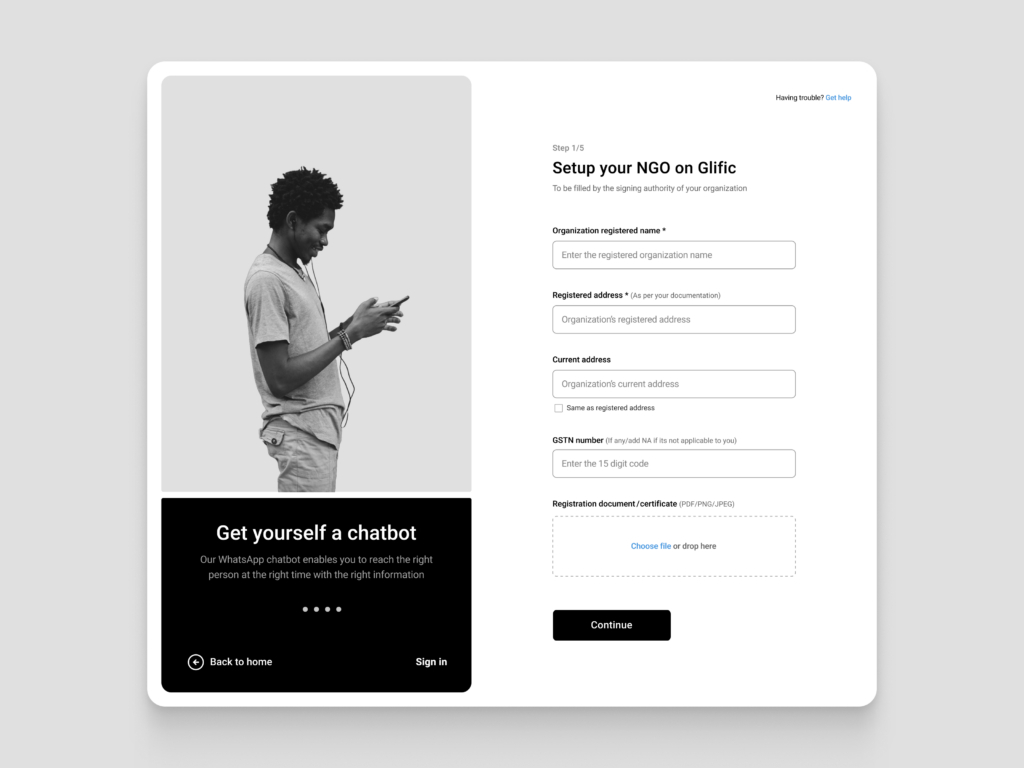
This version includes a multi-step form filling screen, and the image was added to draw the user’s attention during the onboarding setup. Users can view the platform’s features after providing accurate information at each stage of the form individually.
What made this less effective?
This is effective for the first sign-up/sign-in screens, but it is ineffective for screens with multiple fields (forms) to complete because it directs the user to the image instead of the form’s required fields.
The most important aspect of a platform was absent in this case: branding. This form can be viewed in multiple screen sizes, so we had to optimize it considering the screen size and amount of data entered.
Connecting the dots : The new approach
To help users know what to expect before filling out the form, we added an information page at the beginning. As a result, we reduced the form’s content to four steps while maintaining the most crucial ones.
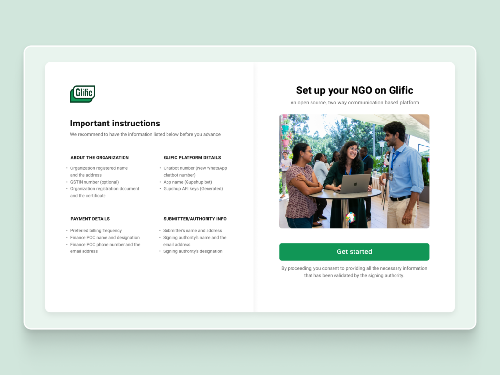
What made it effective?
Additionally, informing users in advance of what to expect from filling out the form, as well as minimizing the amount of information reduction, reduces cognitive load. Additionally, the form’s required number of steps was reduced from five to four following several discussions.
The optimized version had minimal scrolling, and the user could consume most of the information without scrolling. Easier information filling and less scrolling down the page would result from properly spaced input fields and content.
It all comes down to collaboration, creativity and user-friendly thought process in the end
Therefore, it is crucial to collaborate with the teams and iterate continuously in order to obtain the best answers—that is, user-friendly, optimal solutions that are simpler to implement.
We used a similar strategy, beginning with an understanding of Glific’s challenges in compiling a large amount of data from their clients. As we went along, we worked through iterations, identified the relevant issues, and conferred with the team to find better solutions by lessening the user’s cognitive load.
Stay tuned for more design content here. Don’t forget to check out our Dribbble page for additional design inspiration and updates.