Whitespace - Design Principles

Design principles are a set of guidelines used to create an aesthetically pleasing design. Key principles include contrast, balance, emphasis, proportion, hierarchy, repetition, rhythm, pattern, whitespace, movement, variety, and unity.
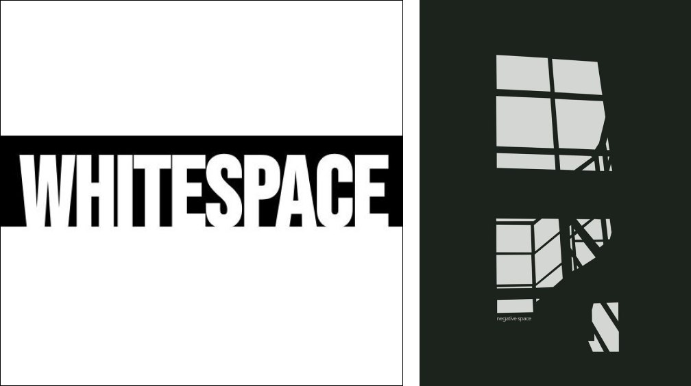
Whitespace
Whitespace, also referred to as negative space, is the unused or empty area around, within, or between the different elements of a design. Although it may not be the main focus of a design, it is still an essential aspect of good design. Whitespace plays a vital role in enhancing concentration, establishing visual hierarchy, conveying distinction, fostering equilibrium, and creating a cohesive design.
Importance of Whitespace in Design
- Increases User Interaction
Effective use of whitespace increases user interaction by creating a good contrast between elements.
- Creates distinction between elements
When we use negative space or whitespace in design, it creates high contrast and good distinction, which is essential for functional design.
- Increases User Interaction
Effective use of whitespace creates contrast and boosts user interaction.
- Indicates the relationship between elements
The amount of whitespace between two elements can indicate whether they are related or not. If two elements are related, decreasing the whitespace between them can group them together, while increasing the white space between two elements that are not related can indicate that they are not part of the same group.
- Brings consistency to the design
Consistency in design is crucial for creating functional designs. It helps in grouping elements, images, text, etc. together, making it easier for users to consume information efficiently. For instance, in websites and other functional applications, consistent spacing between elements is essential to help users navigate the content easily.
- Helps create Balance in the design
Creating the right balance between the negative space and elements is crucial for logo and poster designs to achieve a visually balanced composition.
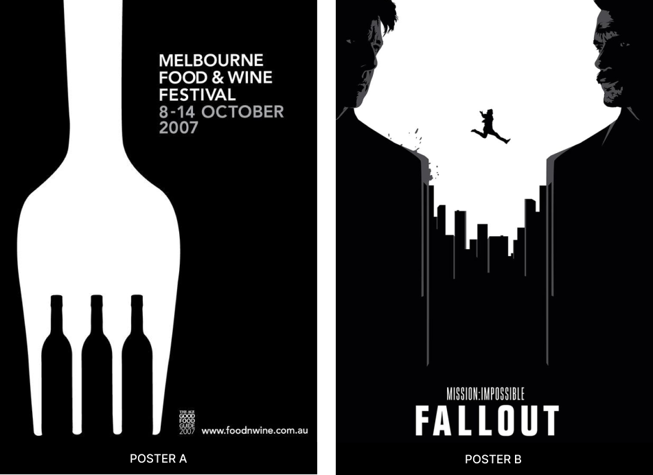
Poster A utilizes the concept of negative space, with a fork and wine bottles used as visual representations for quick identification of the event’s theme. The content on the right-hand side of the poster provides information about the event and when it will take place, which are the two main pieces of information grouped together. Additionally, the link to the event is placed at the bottom, separately, as only those interested in attending will seek it out.
The poster has a well-designed layout where all the elements are visually balanced. The primary text is prominent with enough whitespace around it, which draws attention to the event details. The visual representation of the poster is not only interesting and unique, but it also effectively communicates the message it intends to convey.
Poster B is a well-known movie poster that utilizes the concept of negative space to create a powerful visual representation of the film. By skillfully balancing the various elements in the design, the poster achieves an overall sense of visual harmony. The name of the movie is prominently displayed beneath the artwork, which effectively communicates to viewers what the movie is about.
Case studies & examples
FedEx logo design
The FedEx logo is a good example of how negative space can be used, for the iconic hidden arrow, designer Lindon Leader paired the Universe 67 and Futura Bold fonts. This is an example of intentional usage of negative space, the hidden arrow not only adds intrigue but also conveys the message of movement and efficiency, which aligns with the core values of FedEx.

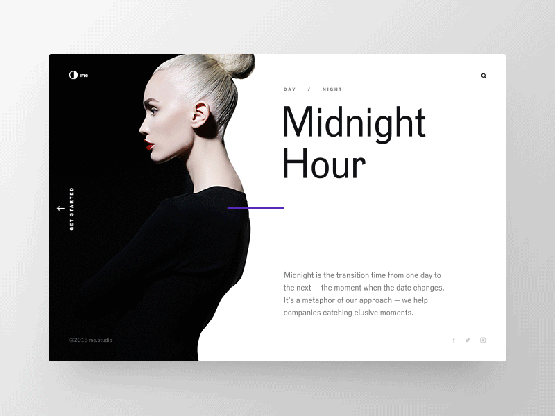
Website design with negative space
The website design featured below provides an excellent example of how whitespace can be utilized to separate functional elements from non-functional ones. A portrait of a woman is used as a separator, skillfully blending in with the background and creating a subtle merge. The left side of the website contains the main navigation menu and profile elements, while the right side provides users with information to consume. Adequate whitespace is provided around the text to ensure good readability.
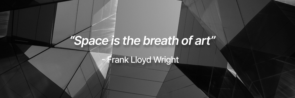
Frank Lloyd Wright, the renowned architect, explains that space is a fundamental element found in every piece of art. Painters imply space, photographers capture it, sculptors rely on it for form, and architects build it. Space is an essential aspect of each of the visual arts.
Movement
Movement is a design principle that guides the viewer’s gaze through a design by creating pathways. Artists use this to direct attention towards specific elements in their artwork.
Importance of movement in design
It is important to create movement in design. In websites, we create movement by bringing in the concept of hierarchy, the heading text is larger and bolder than the body content, which is of lesser weight and size, this creates movement and good contrast, increasing the readability and contrast. This helps users consume information efficiently.
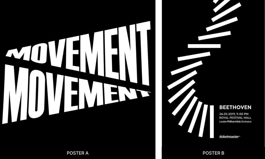
In posters, creating movement helps lead the viewer’s eye, the poster below is a good example of how the concept of movement is used to convey the information. The visual element used creates movement and leads the viewer’s eye toward the event and the details about the event.
How do we create movement in design?
- Rhythm
When a pattern is repeated in a particular direction the human eye follows in that direction. This creates movement.
- Hierarchy
A good hierarchy directs the viewers on what to look at in a design, this is very important in functional designs where users or viewers are trying to consume some information.
- Alignment
Through alignment, we can guide the user’s vision and apply the movement principle. When we align things together, it forms a group.
Case studies & examples
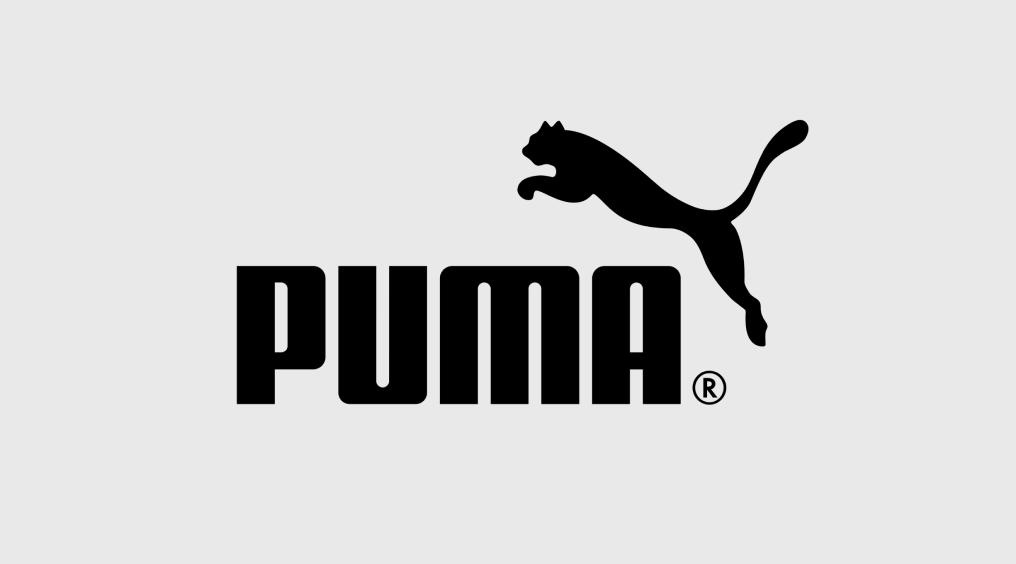
Puma logo design
The Puma logo is a predator cat, performing a jump. It implies movement, velocity, strength & power. Any sports fan surely wants to feel the way Puma does, which is why it was a commercial success.
The idea for this logo was suggested by the founder Rudolf Dassler, he believed that this product is associated with characteristics of a cat. The brand symbolizes speed, endurance & agility, which are some qualities that athletes share too. Showcasing the wild cat in a jumping position creates movement in the design and is a good representation of what the brand stands for.
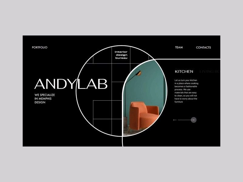
Website design with movement
The web design below is a good example of how we can direct the user to view a dynamic website in a certain direction.
The text describes a well-structured approach to presenting a brand on a website. It recommends starting with a brief introduction of the brand name and its services, followed by a visual example of their work with some supporting text about their area of expertise. Finally, the website should include links to important information such as contact details and team members. This approach ensures that users can easily understand the brand and navigate the website.
Pattern
Repetition of design elements makes a pattern. While repetition focuses on a single element being repeated, pattern refers to multiple elements repeated throughout a design.
Importance of pattern in design
Pattern refers to the repetition of various design elements. There is much more to creating a pattern in functional designs. While designing websites for a particular brand, it is important to bring in the brand identity throughout the design. Usage of patterns and repetition of colors is one way we can create brand recall.
One way to achieve consistency in the design of a platform is by reusing design elements, colors, font weights, and font sizes to create a pattern. UX designers typically create style guides and brand books before starting the design process to ensure that the brand identity is maintained throughout the design.
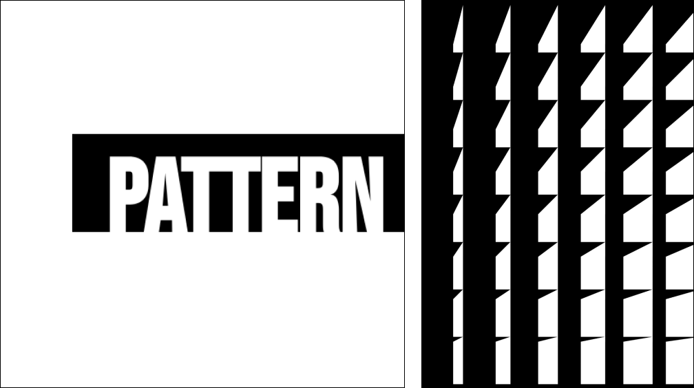
Usage of pattern in design
- Rhythm
Creates visual beat that adds order and continuity to the design
- Dynamics
Enhances the design by bringing visual interest.
- Movement
Enhances the design by bringing visual interest.
- Visual Coherence
Creates a visual flow that can guide the viewer’s eyes
Case studies & examples
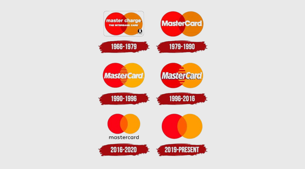
Mastercard logo design
The master card logo has been modified several times in the past few decades. The picture below shows a compilation of all the logos, till the present day.
The Master Card logo from 1996 -2016 created a pattern with the repetition of the circle and the stripes to give a sophisticated and elegant feel to the logo keeping the colors constant, to retain the brand identity but create a pattern with the stripes
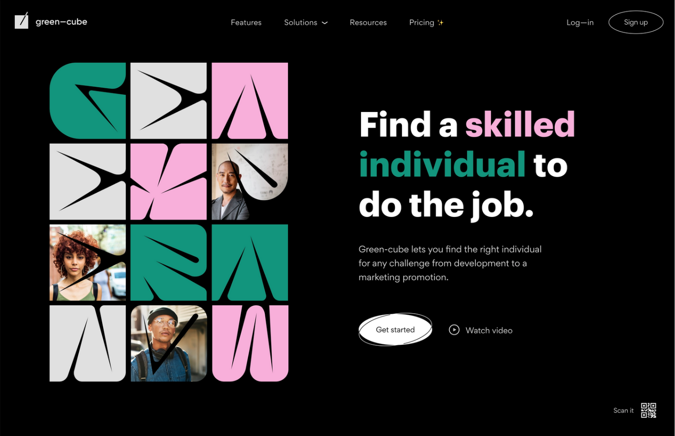
Usage of patterns in web design
The web design image below is a good example of creating patterns in web design. Not only have they created interesting patterns to catch the viewer’s attention, but they have also used many elements that bring in the brand identity. The colors, and the usage of letters in a very specific way to create a pattern.
When designing, it is important to consider the principles of white space, movement, and pattern. When applied effectively, these principles can improve the user experience by making the design both functional and visually pleasing. Understanding how to incorporate these principles into a design is crucial for achieving the desired results.
Elevate your design game with our expert team of designers. Partner with the leading UI/UX design company in Bangalore for stunning results. Contact us today!