UI/UX Wrapped 2025: Trends That Designed the Year
Like Spotify Wrapped for designers – but with more buttons and fewer playlists.
Welcome to UI/UX Wrapped 2025 – your annual retrospective of what truly shaped the digital design world this year. We’re talking trends that launched a thousand Figma files, patterns that made designers debate at 3am Slack threads, and the epic fails that made us all go… why did that ship?
2025 was a year of AI magic, 3D adventures, and interfaces that finally started to feel alive. Dive into the highlights (and lowlights) of the past 12 months in UI/UX design – Wrapped style.
Most Loved UI Trend:
Adaptive Interfaces & Bento-Inspired Layouts
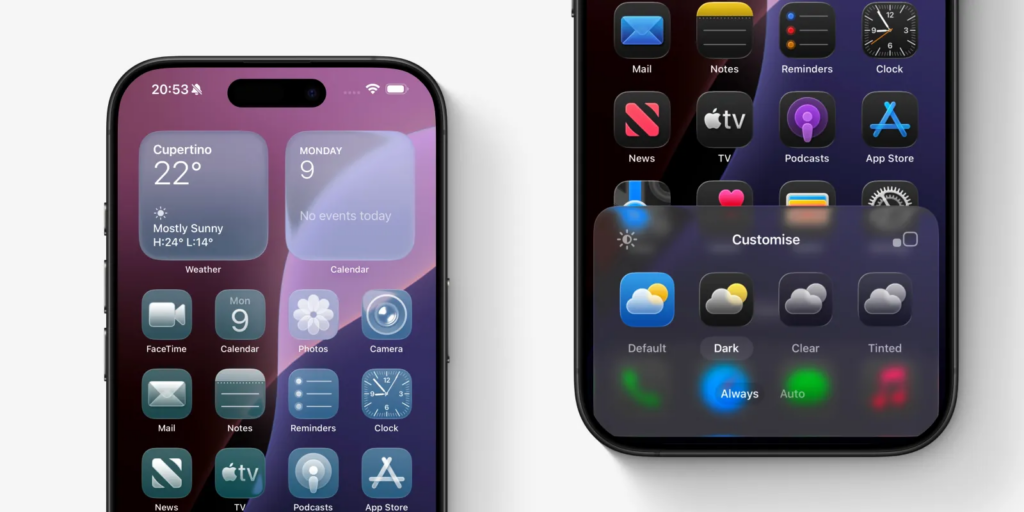
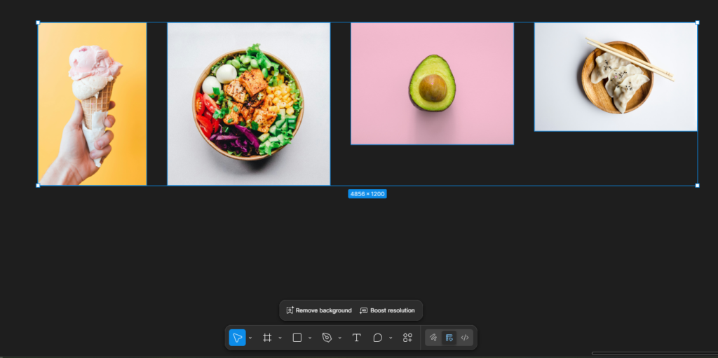
Customisable iOS home screen content ( Reference: 9to5mac website )
Imagine an interface that feels tailor-made for you — not everyone else. That was the essence of the Adaptive UI trend in 2025. From layouts that rearranged themselves based on user behavior to colors and content that shifted to preference signals, personalization became less “nice to have” and more expected.
But the real crowd-favorite layout style?
Bento-style & modular grids — think organized digital lunchboxes that guide your eyes with intuitive blocks of content. Clean, visual hierarchy-friendly, and responsive across screens big and small.
Why we loved it:
- Clean visual hierarchy helps content breathe
- Works beautifully on mobile & desktop alike
- Makes even complex dashboards feel… not overwhelming
Flexible content within the Bento grids ( Reference: Atomize design website )
Most Debated UX Pattern:
Immersive 3D vs Practical Usability
Some loved it. Some wished it’d chill. Welcome to the era of immersive 3D and spatial UX. In 2025, interfaces broke the flat plane, literally, with 3D transitions, AR previews, and spatial elements that added depth and engagement to everything from e-commerce stores to educational apps.
The hot take:
- Pro: 3D gives users a sense of exploration and play
- Con: If overdone, it becomes confusing rather than helpful
This schism sparked many Twitter debates and long threads in design communities -“Is 3D usable, or just shiny?”
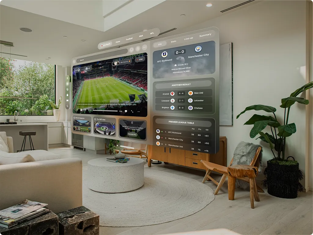
Spatial UI Design ( Reference: Sports Live Streaming by Jordan Abdul Aziz on Dribbble )
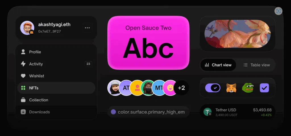
Top UX Trend of the Year:
AI-Driven Personalization
It wasn’t just aesthetic — AI shaped behavior-aware experiences. Interfaces began adapting layouts, suggesting actions, and predicting needs before users even clicked. Whether that was form autofill, tailored navigation paths, or content reorganizing on the fly, AI became UX’s co-pilot in 2025.
What that looked like in practice:
- Smart recommendations that felt helpful instead of creepy
- Dynamic UI elements adjusting in real time
- Predictive patterns that felt learned, not forced
Figma AI auto-recommendation when images are clicked
Breakout Motion Trend:
Kinetic Typography & Micro-Interactions

Kinetic Typography ( Reference: Push Pull by Svmn on Behance )
Tiny animations = big vibes. This year, micro-interactions and kinetic typography (words that move!) dominated screens as subtle cues to delight and guide. Buttons to animated text to hover surprises — little motions made huge impact.

Why motion mattered in 2025:
- Increased feedback & clarity
- Higher engagement rates
- A sense of playfulness without sacrificing usability
Loading state/user feedback ( Reference: Loader Animation Micro Interactions by Yogesh Madharam on Dribbble)
The Most Screenshot-Worthy Visual Trend of 2025:
Apple’s Liquid Glass
Apple’s Liquid Glass look defined visual polish in 2025 — soft translucency, layered depth, and light-reactive surfaces that felt almost physical. Inspired by frosted glass and fluid motion, this aesthetic brought a premium, tactile quality to interfaces without overwhelming the user.
Rather than pure decoration, Liquid Glass became a signal of focus, hierarchy, and system intelligence, especially across Apple’s ecosystem and apps influenced by it.
How it helped:
➡ Created depth without heavy shadows or borders
➡ Helped users distinguish foreground actions from background context
➡ Elevated minimal UIs while keeping them intuitive
Liquid glass on iOS 26 ( Reference: Apple)
Design Fail of the Year:
Overhyped “Zero-UI” That Was… Zero Clarity

Zero-UI — interfaces you don’t see — promised hands-free everything. But when taken too literally, some products felt like no guidance at all. Imagine a screenless app that only listens for unclear voice commands… awkward.
Were expectations too high? Kind of. The concept is forward-looking, but execution often left users confused rather than empowered — especially without rich feedback cues.
Lessons Learned:
- Invisible interfaces still need visible signals
- Feedback is UX currency — if users don’t know what’s happening, they drop off fast
Trend That Texted Your Brain:
Ethical & Sustainable UX Design
Design isn’t just about pixels — it’s about people and the planet. In 2025, ethical design principles took center stage. Sustainable UX meant lighter UIs that don’t eat data or device battery, privacy-first personalization, and humane design that prioritizes choice and respect.
Why it clicked:
- Lower data usage means faster loading & happier users
- Ethical defaults reduce dark pattern fatigue
- Inclusion boosts brand trust
Ethical Design ( Reference: Daily Ethical Design by alistapart.com )
Most Rewinded Pattern:
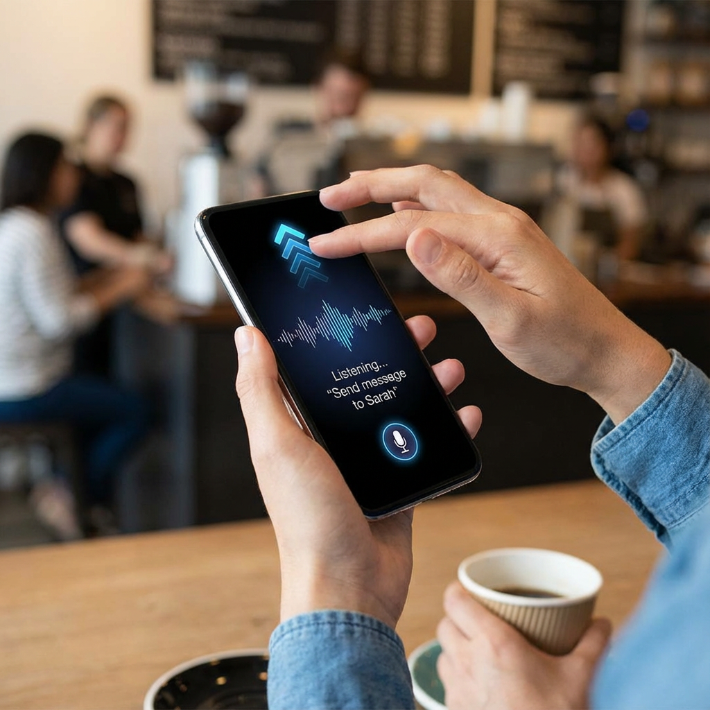
Voice & Gesture Interfaces
This year’s “you said what?” — voice and gesture UI matured beyond novelty into real UX tools. From dashboards to smart home controls, users increasingly expected hands-free options.
But yes, debates were loud:
- Great for accessibility
- Less ideal in noisy environments
- Needs clear visual backups
UI/UX Icon of the Year:
Bold Typography That Speaks Louder Than Words
Big type was everywhere in 2025 — oversized headers, expressive fonts, and typography that felt alive. Bold type became a navigation and emotion driver, not just decoration.
How it helped:
➡ Provided hierarchy in content-rich interfaces
➡ Set tone without extra UI elements
➡ Guided users visually and emotionally
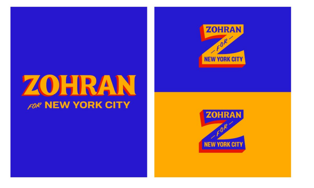
Zohran Mamdani’s Campaign Branding
Reflections From 2025
2025 wasn’t just a year of new tricks — it was a maturation of UI/UX thinking. Designers balanced aesthetic exploration (hello 3D) with ethical responsibility. AI didn’t replace designers — it amplified intention. And users didn’t just want pretty screens — they wanted interfaces that understood them.
As we swipe into 2026, one thing is clear: Human-centered design isn’t a trend — it’s the foundation.
If you’re looking to elevate your product’s user experience or need a team that can build thoughtful, scalable interfaces, Think201, a leading UI/UX design company in Bangalore, is here to help you design with purpose and consistency. Let’s build something users will love.
Written by Gomathi AB