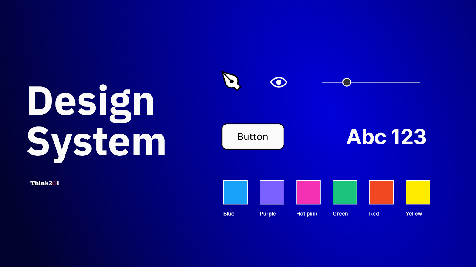
Design Systems: Blueprint for Scalable, Consistent Digital Products
In today’s digital world, where products must adapt across screens, platforms, and user contexts, design consistency is no longer a nice-to-have – it’s essential. But achieving consistent visual language, behavior, and interaction across a growing product suite isn’t simple. That’s where a design system comes in.
A design system is more than just reusable UI patterns. It’s a strategic ecosystem of guidelines, components, principles, tokens, and documentation that empowers teams to build beautiful, consistent, and accessible products – faster and with less friction. From design to development and beyond, design systems enhance collaboration, reduce duplication, and speed up delivery.
In this comprehensive guide, we’ll unpack what design systems are, why they matter, how they’re structured, and best practices for building one that scales with your product and team.
What is a Design System?
At its core, a design system is a centralized repository of patterns, components, and best practices that enables teams to create user interfaces with consistency and efficiency. Unlike a style guide (which often focuses primarily on visual tokens like color and typography), a design system encompasses:
Design systems are living products — not one-time deliverables. They evolve with your product, team needs, and emerging UX best practices.
A design system turns design intent into implementation reality, acting as a bridge between designers and developers, ensuring everyone operates from the same shared language.
Check out these Blogs:
Design system 101: What is a design system?
Why Design Systems Matter
Without a design system, teams often face:
- Inconsistent UI patterns across features
- Reinvented work and duplicated efforts
- Disconnected visual and functional experiences
- Slower delivery due to repetitive decision-making
Here’s how a design system solves these challenges:
1. Consistency Across Products
Users expect familiar interactions. A design system ensures buttons, forms, navigation, and feedback patterns feel coherent across web, mobile, or desktop. Consistency leads to trust and ease of use.
2. Faster Design & Development
When designers and engineers rely on a shared library of components and standards, they spend less time recreating the wheel. Teams can assemble interfaces like building blocks.
3. Better Cross-Team Collaboration
A design system creates a single source of truth. Everyone — designers, developers, product managers and QA — understands what to use and how to use it, reducing misunderstandings and costly rework.
4. Scalable Product Growth
As products expand and features multiply, a design system acts as the foundation supporting scale, enabling teams to onboard new contributors quickly without sacrificing quality.
5. Encourages Inclusive, Accessible Design
When accessibility guidelines are built into the system, every component supports inclusive practices — from contrast ratios to keyboard navigation — making experiences better for all users.
Core Elements of a Design System
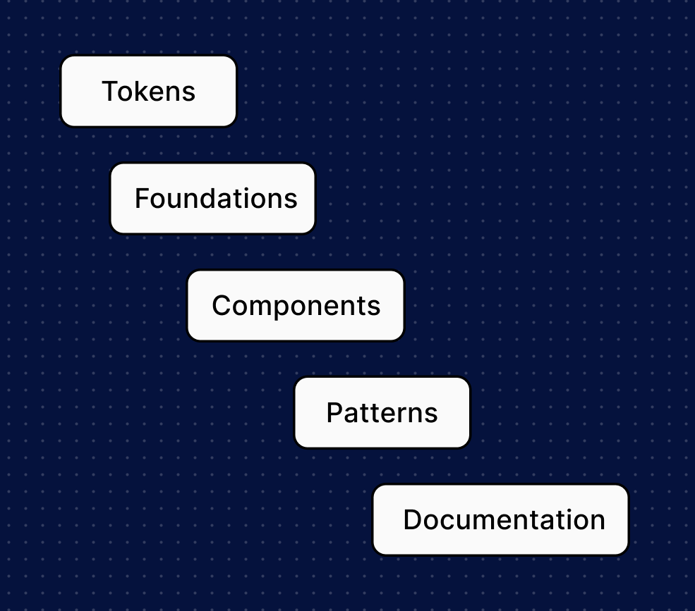
A successful design system includes these key pillars:
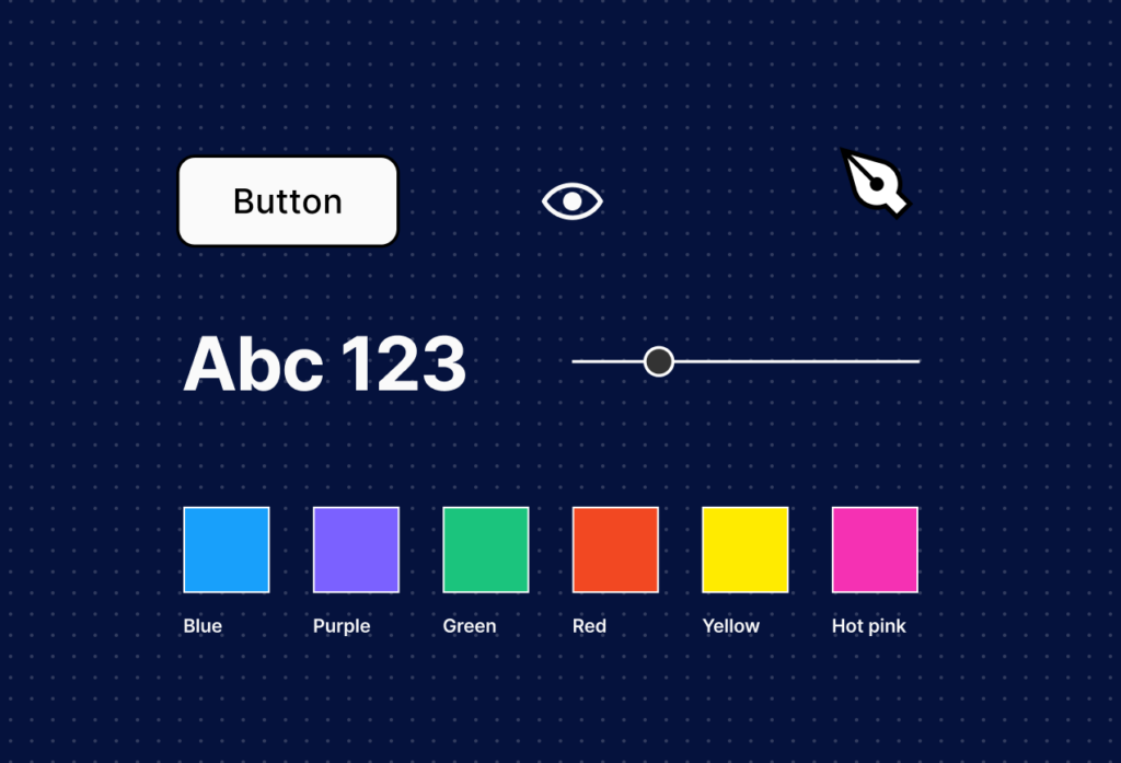
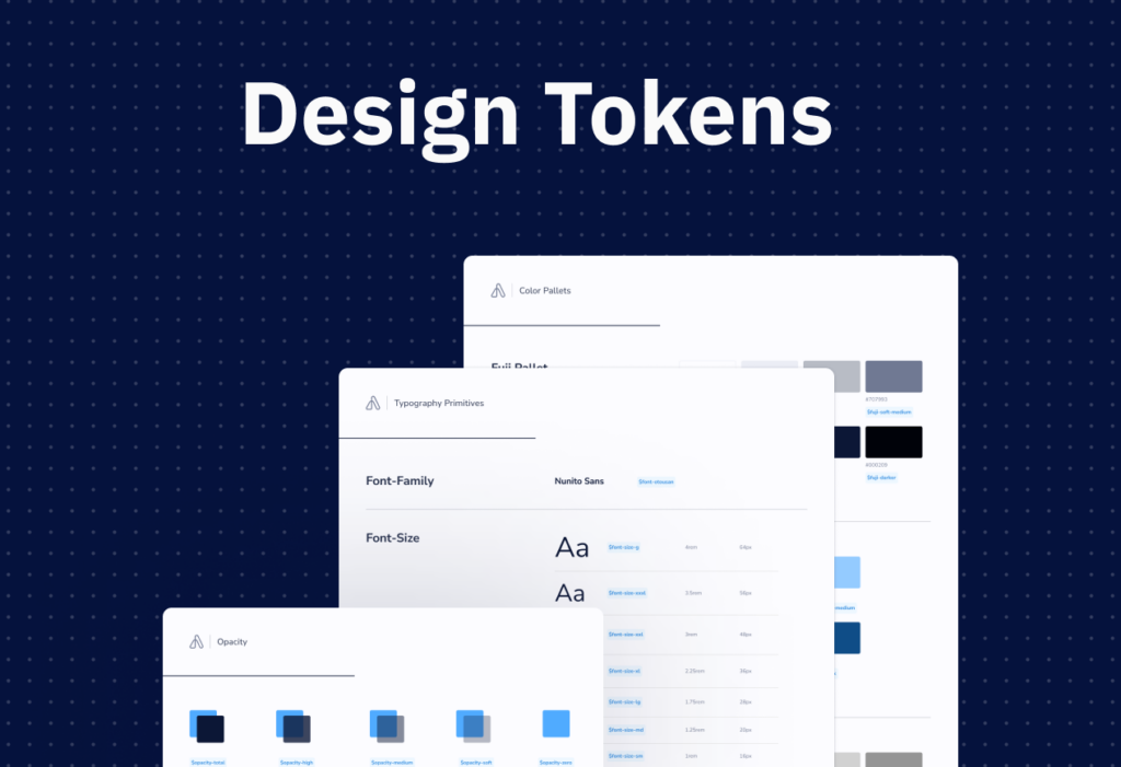
1. Design Tokens
Design tokens are the smallest units — variables that store values for:
- Colors
- Spacing and layout units
- Typography scales
- Shadow and elevation values
These tokens enforce consistency and flexibility, enabling theme changes without rewriting styles.
2. Foundations
Foundations include brand identity elements such as:
- Color palettes
- Typography rules
- Iconography guidelines
- Grid systems
- Voice & tone
They define how things look and why they behave a certain way.
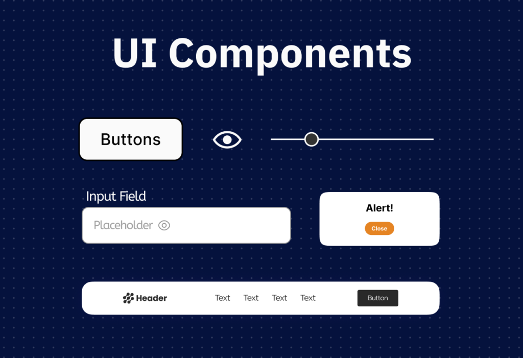
3. UI Components
Components are reusable UI elements like:
- Buttons and input fields
- Cards and modals
- Navigation bars and footers
Each component includes:
- Visual styles
- States (hover, focus, disabled)
- Accessibility rules
- Code implementations
4. Patterns
While components are singular elements, patterns are combinations — for example:
- Search + results layout
- Form flows
- Onboarding screens
Patterns solve recurring UX problems by arranging components into meaningful context.
5. Documentation & Guidelines
Clear documentation bridges understanding:
- Usage rules
- Do’s & don’ts
- Accessibility standards
- Code snippets
- How components behave on different screens
Great documentation makes a design system adoptable.
How to Build a Design System: Step-by-Step
Step 1: Audit and Discover

Start by taking inventory:
- What UI elements already exist?
- What patterns are duplicated?
- What inconsistencies exist between screens and features?
This helps define what you already have vs. what you need.
Step 2: Define Design Principles
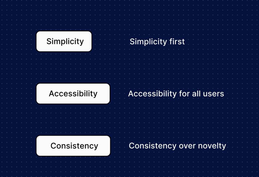
Design principles are foundational beliefs that guide decisions.
These principles help when choosing how components behave or when patterns evolve.
Step 3: Establish Tokens & Foundations
Define your base tokens for color, typography, spacing, and other foundational elements. This is where the visual language becomes code-ready.
Step 4: Build UI Components
Begin with foundational, frequently used components
Document these components thoroughly.
Step 5: Write Clear Documentation
Make the system usable:
- “How to use this button”
- “When to choose primary vs. secondary styles”
- “Behavior on hover, focus, disabled”
Include code examples and interactive previews if possible.
Step 6: Align Teams & Establish Governance
Invite designers, developers, product managers, and accessibility advocates into the process. Establish ownership — someone or a committee responsible for updating the system.
Step 7: Release and Iterate
Release your initial version and invite feedback. A design system evolves; regular updates prevent stagnation and drift.
Design System Do’s and Don’ts
Common Challenges & How to Overcome Them
Challenge: Keeping the System Up-to-Date
As products evolve, components can fall out of use or become inconsistent.
Solution: Treat the system as a living product — schedule regular audits and updates.
Challenge: Token Mismanagement
Poor token naming or organization leads to confusion.
Solution: Establish token standards early and document usage rules.
Challenge: Adoption Resistance
Teams may be slow to adopt a new system.
Solution: Provide training, demos, and use cases showing how the system saves time and improves quality.
Design Systems & UX: Better Together
A design system doesn’t replace UX research or wireframing — it enhances it. While wireframes help validate structure and user flow early in the design process, a design system ensures those validated ideas can be translated into consistent, reusable UI elements. Wireframes reduce uncertainty; design systems reduce repetition and inconsistency.
In practice, teams often begin with wireframes to confirm user flows and then apply design system components to build high-fidelity screens. This approach ensures both usability and consistency from ideation to implementation.
Final Thoughts: Design Systems as a Strategic Asset
A design system is more than a collection of UI files or tokens — it’s a strategic, collaborative tool that empowers teams and improves product quality. When done well, design systems:
✅ Increase development speed
✅ Ensure visual and interaction consistency
✅ Improve cross-team collaboration
✅ Support scalability and growth
Whether you’re a startup building your first design system or a large enterprise scaling across multiple products, investing in a thoughtfully structured system pays dividends in efficiency and user experience.
Written by Gomathi AB