Figma Libraries: The Backbone of Scalable Design Systems
In collaborative UI/UX design, ensuring consistency, reusability, and efficiency across screens and projects is crucial — and that’s where Figma Libraries come in. Just as wireframes help outline structure early in UX design, libraries help teams manage reusable design assets like components, styles, and variables across files and projects. Whether you’re working on dashboards, mobile apps, or design systems, libraries help you streamline workflows and maintain design harmony across teams.
Why Figma Libraries Matter
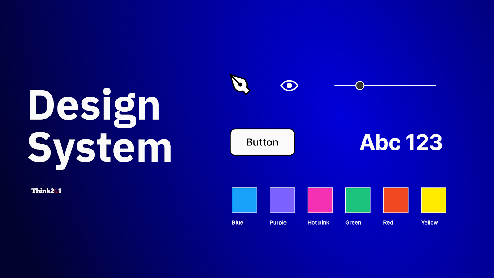
A Figma Library is a shared collection of design assets — components, styles, and variables — that teams can reuse across multiple Figma files. Once published, these assets can be accessed and applied in other files, ensuring a single source of truth for design elements
Instead of reinventing buttons, icons, or text styles in every project, libraries let teams centralize and standardize UI and UX building blocks. When updates are published, designers across files can review and accept changes, making design evolution smoother and more controlled
Key Benefits of Using Figma Libraries
Figma Libraries strengthen design systems in several ways:
1. Maintain Consistency Across Projects
When components like buttons, forms, and icons are stored in a central library, every project can pull from the same set of UI elements, ensuring visual and functional harmony.
2. Speed Up the Design Process
Designers don’t need to recreate common patterns or elements from scratch. By pulling from a well-curated library, teams can assemble screens faster and with fewer errors.
3. Simplify Team Collaboration
Team members and stakeholders always reference the same source assets. Updates to components or styles propagate to all files where they’re used — reducing guesswork in handoffs.
What You Can Include in a Figma Library
Figma libraries support three major asset categories:
Components
Reusable UI elements — like buttons, cards, nav bars, or icons — defined once and instantiated throughout your designs. These instances stay linked to the main library component and receive updates when published
Styles
Collections of shared design rules — colors, text styles, effects, and grids — that help maintain visual consistency across screens.
Variables
Reusable dynamic values — like spacing units, breakpoints, or even theme tokens — that can be applied to properties across components
How to Create, Publish, and Use Libraries in Figma
Step 1: Build Your Design Assets
Start in a dedicated file where you create components, styles, and variables you intend to reuse.
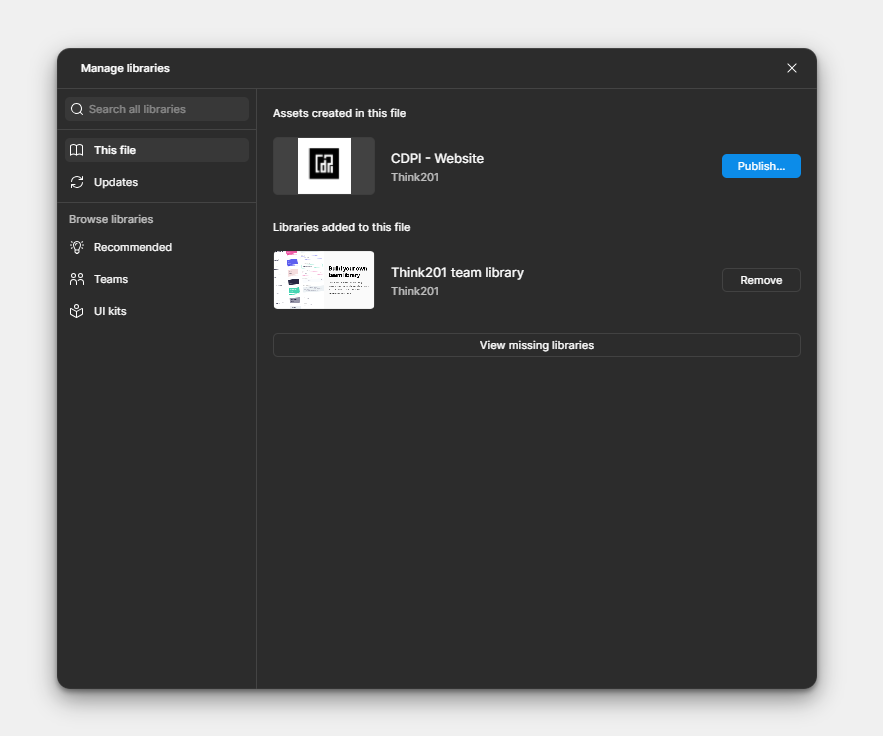
Step 2: Publish as a Library
Once your assets are ready, publish them as a library so they become available to other design files. In Figma, this is done through the Assets > Library > Publish workflow
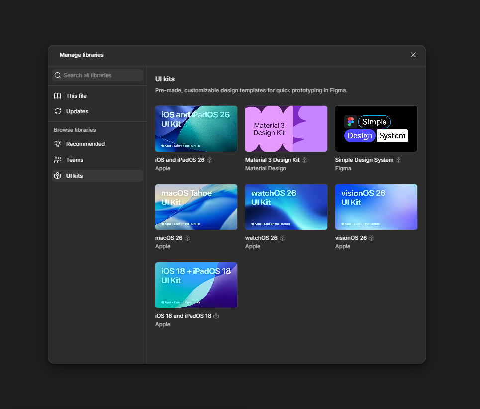
Step 3: Enable the Library in Another File
Open another design file, go to Assets > Libraries, search for the library name, and Add to file. You can now drag components or apply styles from the library
Step 4: Review and Accept Updates
When the original library file is updated and re-published, Figma notifies all files using it. Designers can review and accept changes to keep designs up to date
Best Practices for Managing Figma Libraries
To ensure long-term success with libraries:
• Organize with Clear Naming
Use descriptive, predictable naming conventions for components and styles (e.g., “Button / Primary / Default”). Consistency in naming makes it easier to search and reuse assets.
• Document Usage and Tokens
Maintain documentation on how and when to use specific components and variables. This helps designers (and developers) work faster and with fewer mistakes.
• Keep Libraries Lean
Avoid clutter by archiving unused components and styles. Periodic audits help keep your library efficient and relevant.
Conclusion
Figma Libraries are more than just a convenience — they are a critical tool for scaling design, improving collaboration, and maintaining consistency across teams and products. By centralizing components, styles, and variables into shared libraries, teams can build faster, stay aligned, and evolve designs with confidence.
Whether you’re a solo designer or part of a large UX team, mastering Figma libraries will elevate your design workflow and help you deliver polished, coherent experiences across every screen.
If you’re looking to elevate your product’s user experience or need a team that can build thoughtful, scalable interfaces, Think201, a leading UI/UX design company in Bangalore, is here to help you design with purpose and consistency. Let’s build something users will love.
Written by Gomathi AB